Logo jobs are great. Logo jobs from referrals are awesome. I love it when my clients love the work I do for them as much as I do! I have had a few comments to that effect lately ….
“I am super happy with the last logo you designed for me and have an additional one I would like for you to design for my other business.” Dave
“Again, thank you so much! I’m still giddy when I open it, which is a great sign.” Theresa (she was looking at the logo file several days after completion)
“Consider the ad approved. Very happy with the design!” Casey
Anyway … back on topic 🙂
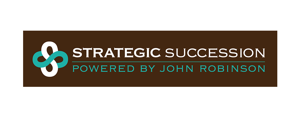
This particular client had existing colours in place and a logo that needed a name change and an over haul. They also needed the it to include a stand alone icon that could be used as a social media profile picture and wanted a strong, clean look incorporating the double S’s if possible. I offered him several concepts but he chose the one that gave the biggest nod to his current logo. The biggest challenge on this job was the colour limitations (brown, turquoise and white) and the fact that the website logo was going to be placed on a dark brown background and it had to fit in a long narrow space. Unfortunately long narrow logos are limiting in other applications such as business cards and letterhead. The solution I came up with was two versions – one for the printed applications and one for the website. They loved it, and it has been the beginning of a happy ongoing business relationship as they work through business cards and web graphics.
This is the concept combination he went with:


