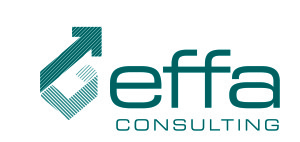
Sometimes the best way forward isn’t straight ahead. This was the idea my client Effa Consulting, (a business consultant specializing in mergers and acquisitions) wanted to convey through the logo design he asked me for recently. Some other criteria included:
- small e like the old Eaton’s logo just before they folded
- simple, modern font (we make your work life simpler….)
- some shade of darker blue
- some sort of arrow or “chart”, preferably going up and to the right, to show momentum, growth, progress.
This is the final design. He was more than pleased and I liked it too. You can read his comments on it on here.


