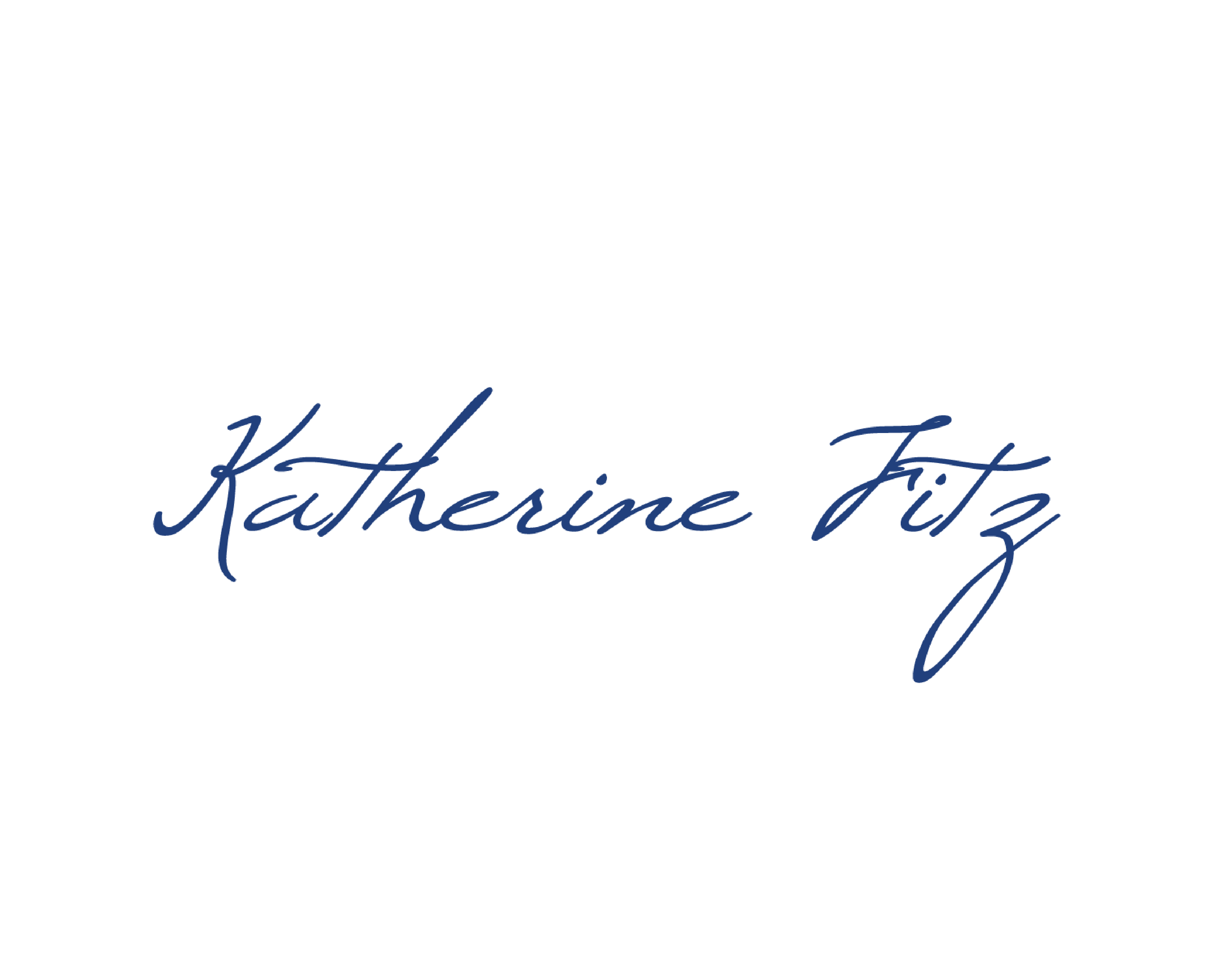
company logos
What should a company logo incorporate? Does my company logo need a symbol? What is a wordmark?
Great corporate logos, like Nike or Apple who have evolved their brand to the point where they don’t need words to supplement the symbol, flash to mind when we think about this topic. For most of us though that place in marketing heaven is a long way off.
So … where to start?
Your company logo should be a simple, instantly recognizable, easily read word and/or symbol that represents your company. Like many things that look simple on the surface, it’s the craft behind what you DON’T see that makes the finished product look professional and workable.
For small companies with a limited marketing budget often the best choice is a wordmark logo. A wordmark is a uniquely styled font that spells out your company name. ‘That’s easy,’ you say, I don’t need a designer for that, I can do it myself – in fact my kid / friend / neighbour / grandmother can do that.
Wrong.
“A logo is not ‘just a graphic’ anymore than a flag is a piece of coloured cloth,” says John McWade, founder and creator of Before and After magazine.
Pitfalls await the amateur:
- Does it work in both black and white as well as colour?
- Is it re-sizeable and to what degree?
- Can you create the different file types required by printers for various printing formats?
- Can you place it on a coloured background without the dreaded white frame?
A wordmark is actually the most difficult kind of logo to do successfully as it does not have an accompanying mark/brand, relying only on the execution of the type to represent an entire brand. A few great examples are ebay, google and Coca Cola’s logos.
Professional company logos are essential in today’s competitive marketplace. Are you happy with yours?


