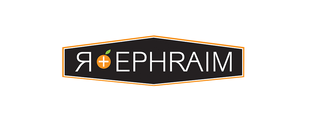
All kinds of people go into business. Even ones who aren’t 100% sure what the nature of the business will end up being. A true entrepreneur, this client wanted to keep his options open and have a versatile logo that could encompass several different types of business ventures. The name of the business R-Ephraim kind of threw me at first but after he explained the meaning behind it, the design started to come together. This was actually the first concept I came up with. I had a hard time coming up with some alternatives after that as this one felt perfect. He actually agreed and did go with the first concept in the end. So … what does it all mean? The R is partly because his last name starts with an R and partly a reference to the word ‘our.’ The word Ephraim in Hebrew means ‘God has made me fruitful,’ implying multiplied blessing. The stylistic piece of fruit with the plus sign in it speaks to the multiplying of blessing and fruitfulness as well as providing a way to bring the letter R into the design. A bonus I discovered later was – orange is his favourite colour! This is a young, style conscious, hipster leaning entrepreneur – hence the hipster vibe.